--a
Hey! Hayato!
What`s she doing??
a--
--b
About Hakanashi??
She won`t react now.
a--
--a
She`s just touching her smartphone.
a--
--b
Hakanashi is part of the NASA secret project.
a--
--a
Oh, it was real that her father is the researcher in NASA.
a--
--b
I`ve heard that inside her smartphone, there are many applications that Hakanashi have created.
a--
--a
So, the secret applications.....
a--
--b
The applications that IQ 206 is making, there should be amazing things inside.
a--
--a
Maybe an application that Billy captain dances with Baby Metal!!
a--
--c
I can`t even imagine that!!!!!
a--
--b
Hakanashi will be with us when she finishes!!!!
a--
--a
Do that at NASA!!!!
a--
--b
This time we will layout the contents section.
a--
--a
Well, we went quite further!!
a--
--b
First, I`ll explain how to create columns and lines.
We`ll do this by several articles.
a--
--b
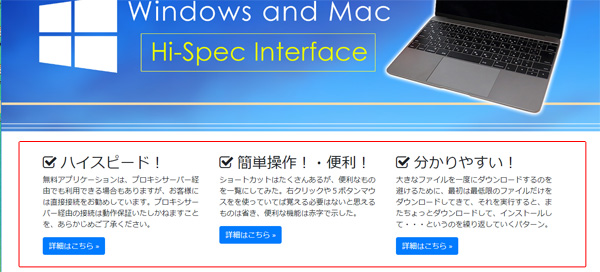
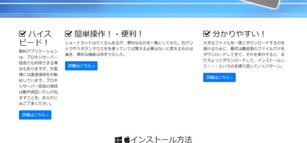
As you can see this, the content is in three columns.
a--
--a
Oh, it`s easier to see it by the three columns.
a--
--b
But, what if these three columns changes to the smartphone layout??
a--
--a
The columns will be really thin and hard to see it.
a--
--b
Yes, when you use Bootstrap, this column will be in a line vertically with the smartphone layout.
a--
--a
Well again, Bootstrap is convenient!!!
a--
--b
Before, we had to make this by CSS from the scratch, but it takes time and effort.
Using a framework will be easier to create!!!
a--
--a
Hayato, hurry! Please show me the way!!!!
a--
--b
Well, Well.... calm down.
a--
--b
Bootstrap already have classes to make columns and lines.
a--
--a
Yes, copy and paste!!!
a--
--b
But, there are various patterns, so this time I will show you with the three columns.
a--
--a
I see.
I have to understand about the prepared classes more to use it for various patterns.
a--
--b
Like the lesson before, we used the <div tag to name the classes.
a--
--a
Yes, like we did it in the main picture.
a--
--b
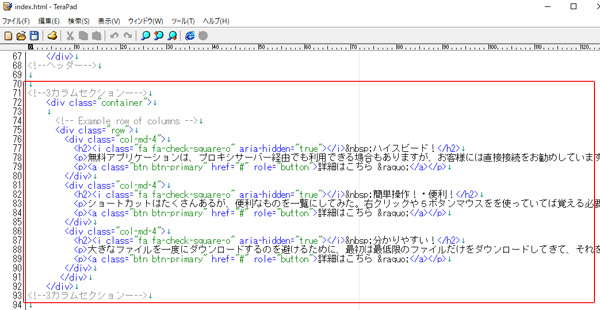
First, let`s make the class called "container", and surround the three column with <div.
a--
--b
The class "container" is to make the contents center, and assign the section to put horizontally.
a--
--a
So I just have to remember that when I make columns, I use "container" to surround.
a--
--b
And also, you can make lines by using a class called "row"!!!
a--
--a
It is not always just one line, so do you use several "row" classes??
a--
--b
Yes.
When you want to make more than two lines, you have to surround each section by "row".
a--
--a
Ok, this time it`s only one line.
a--
--b
Next, we will make the column.
You`ll able to create various patterns by using different class names.
a--
--a
"col-md-4"?????
a--
--b
This "col" means "column".
a--
--a
Oh??????
Karamucho???????
a--
--c
Why`s potato so hot!!! Karamucho!!!!!!!!
No!!!!!!!
That`s the famous snack in Japan!!!!!!!
a--
--b
Column is the horizontal line.
a--
--a
Next is "md"??????
a--
--b
By using "md" you can control the appearance of many kinds of devices.
a--
--b
You can make the Responsive design website by adapting to the tablet and the smartphone layout.
a--
--a
Oh, the one we did it for the navigation section??
Like "sm"????
a--
--b
Yes, you can control the appearance of the devices by using "col-md" as well.
a--
--b
If you use "md" and when the layout changes to smartphone, it lines virticaly instead of horizontaly.
a--
--b
There are other patterns such as "sm" and "lg".
a--
--b
This website shows various patterns about the layout, so I suggest using it.
And you should check the differences between the old version of Bootstrap and the new version Bootstrap 4.
There are many places that have changed.
a--
http://cccabinet.jpn.org/bootstrap4/layout/grid
--b
The last class is this number "4".
a--
--b
The column of Bootstrap is separated into 12, and those decide the width.
a--
--a
Oh, Ok!!!!!!!!
This time the 4 column is separated into three so 4 times 3 = 12!!!!!
a--
--b
Yes, when you control this 12, not only that you can make it the same width of each, but you can set differently.
a--
--b
For example, I have set col-md-2、col-md-6、col-md-4 and made into total 12.
a--
--b
You can see that each width became differently.
a--
--a
That`s nice!!! You can just set number and you can change the width of each!!!!!
a--
--y
Bootstrap4 uses CSS3 flex layout, so if you are interested you can search for this.
a--
--a
You`ve finished with making the application???
a--
--y
It`s not the application that Billy captain dances with Baby Metal.
a--
--a
So your listening all the conversations.....
a--
--a
...and so what kind of application did you make???
a--
--y
That`s a secret information.
It`s meaningless to show you, Himesaki, and you won`t understand even if I tell you.
a--
--a
It`s like an application that you can measure the calory when you eat lots of beef jerky anyhow!!!!
a--
--y
You can`t laugh about beef jerky!!!!!!!
Recently, there are beef jerky curry and beef jerky popcorn selling at the store!!!!!!
a--
--a
I didn`t ask you about that!!!!!!
a--
--c
....Well, can I continue.........
a--
--a
Yes, please do it!!!!!!
a--
--b
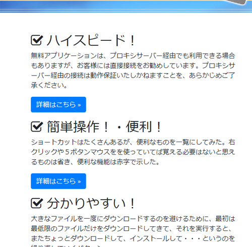
.........Next, let`s put headings to these three columns.
a--
--b
The tag that will be used for headings will be <h1>~<h6>.
There are six types of headings that you can use.
a--
--b
I`ve put heading <h2> and wrote a heading title for each.
a--
--y
The words will be bigger when you use this <h2> tag.
a--
--a
Oh, ya!!!!
It seems to be a headline!!!
a--
--b
The rule is that you have to write <h1> above <h2>.
a--
--b
This time, you can make the main picture as <h1>, or make a title on bottom or top of the main picture and make it as <h1>.
a--
--y
Not only that you can put <h1> in the text, but you can also put on the pictures.
a--
--a
If you put on the main picture, you`ll be putting <h1> to the picture.
a--
--b
And if you are putting on the picture, I suggest using "alt" attribute.
a--
--y
"Acho------"
a--
--a
She joked!!!!!!!!!!
Hakanashi joked!!!!!!!!!
a--
--b
......The one that we made,
<img src="img/main_pic.jpg" class="mb-5 mw-100">
put "alt" on it.
<img src="img/main_pic.jpg" class="mb-5 mw-100" alt="Free Application Download">
a--
--b
"Alt" is an alternate text specified to an image.
a--
--b
Surround this <img with h1.
Then this alt will be the text part.
a--
--b
You should set alt because the text part and the alt part that is surrounded by h1 effects the rank of the search result.
I`ll tell you more on different articles for this.
a--
--b
There is no h1 set on the download sample, because you can choose whether to set on the main picture or the title that you will make, so that depends on you to insert.
a--
--b
So that`s it for today.
Next, it will be the icons before each title and the explanation section underneath it.
a--
c--
--z
「Acho-----」
a--
--f
It seems that she likes it only by herself.
a--


